3.1. Pythonで統計
著者: Gaël Varoquaux
参考
Pythonによるベイズ統計 : この章では、ベイズ統計のツールは扱いません。 ベイズモデリングで特に興味深いのは、Pythonで確率的プログラミング言語を実装した PyMC です。
統計の本を読む: Think stats ブックは無料のPDFまたは印刷物で入手でき、統計学の入門書として最適です。
Tip
なぜ統計にPythonなのか?
Rは統計に特化した言語です。 Pythonは統計モジュールを備えた汎用言語です。 RはPythonよりも統計解析機能が豊富で、特殊な構文もあります。 しかし、統計と画像解析、テキストマイニング、物理実験の制御などを組み合わせた複雑な解析パイプラインを構築する場合、Pythonの豊富さは貴重な資産となります。
Tip
In this document, the Python inputs are represented with the sign ">>>".
Disclaimer: Gender questions
このチュートリアルの例の一部は、ジェンダー問題を中心に選ばれています。その理由は、こうした問題においては、主張の真偽を確かめることが多くの人々にとって実際に重要だからです。
3.1.1. データ表現とインタラクション
3.1.1.1. テーブルとしてのデータ
統計分析で考慮する設定は、異なる attributes または features のセットによって記述された複数の observations または samples です。データは2次元の表として見ることができる、または行列で、列はデータのさまざまな属性を示します、そして観測結果を並べます。 例えば、 examples/brain_size.csv に含まれるデータは:
"";"Gender";"FSIQ";"VIQ";"PIQ";"Weight";"Height";"MRI_Count"
"1";"Female";133;132;124;"118";"64.5";816932
"2";"Male";140;150;124;".";"72.5";1001121
"3";"Male";139;123;150;"143";"73.3";1038437
"4";"Male";133;129;128;"172";"68.8";965353
"5";"Female";137;132;134;"147";"65.0";951545
3.1.1.2. pandasのデータフレーム
Tip
このデータを pandas モジュールから pandas.DataFrame に保存し、操作します。 これはPythonのスプレッドシートテーブルに相当します。2次元の numpy 配列とは異なり、名前付きカラムを持ち、カラムごとに異なるデータ型を混在させることができ、精巧な選択機構とピボット機構を持っています。
データフレームの作成: データファイルの読み込み、配列の変換
CSVファイルからの読み込み: 脳の大きさ、重さ、IQを示す上記のCSVファイルを使用します (Willerman et al. 1991), データは数値とカテゴリー値の混合です:
>>> import pandas
>>> data = pandas.read_csv('examples/brain_size.csv', sep=';', na_values=".")
>>> data
    Unnamed: 0  Gender  FSIQ  VIQ  PIQ  Weight  Height  MRI_Count
0            1  Female   133  132  124   118.0    64.5     816932
1            2    Male   140  150  124     NaN    72.5    1001121
2            3    Male   139  123  150   143.0    73.3    1038437
3            4    Male   133  129  128   172.0    68.8     965353
4            5  Female   137  132  134   147.0    65.0     951545
...
警告
欠損値
2人目の体重がCSVファイルにありません。欠損値 (NA = not available) マーカーを指定しなければ、統計分析はできません。
配列からの作成: pandas.DataFrame は、配列やリストなどの1次元の 'series' の辞書と見なすこともできます。 3つの numpy 配列があるとします:
>>> import numpy as np
>>> t = np.linspace(-6, 6, 20)
>>> sin_t = np.sin(t)
>>> cos_t = np.cos(t)
pandas.DataFrame として触れることができます:
>>> pandas.DataFrame({'t': t, 'sin': sin_t, 'cos': cos_t})
           t       sin       cos
0  -6.000000  0.279415  0.960170
1  -5.368421  0.792419  0.609977
2  -4.736842  0.999701  0.024451
3  -4.105263  0.821291 -0.570509
4  -3.473684  0.326021 -0.945363
5  -2.842105 -0.295030 -0.955488
6  -2.210526 -0.802257 -0.596979
7  -1.578947 -0.999967 -0.008151
8  -0.947368 -0.811882  0.583822
...
その他のインプット: pandas はSQL、エクセルファイル、その他のフォーマットからデータを入力することができます。 pandas documentation を参照してください。
データの操作
data は pandas.DataFrame で、Rのデータフレームに似ています:
>>> data.shape    # 40 rows and 8 columns
(40, 8)

>>> data.columns  # It has columns
Index(['Unnamed: 0', 'Gender', 'FSIQ', 'VIQ', 'PIQ', 'Weight', 'Height',
       'MRI_Count'],
      dtype='object')

>>> print(data['Gender'])  # Columns can be addressed by name
0     Female
1       Male
2       Male
3       Male
4     Female
...

>>> # Simpler selector
>>> data[data['Gender'] == 'Female']['VIQ'].mean()
np.float64(109.45)
注釈
大きなデータフレームを素早く表示するには、 describe メソッドを使用します: pandas.DataFrame.describe().
groupby: カテゴリ変数の値に関するデータフレームの分割:
>>> groupby_gender = data.groupby('Gender')
>>> for gender, value in groupby_gender['VIQ']:
...     print((gender, value.mean()))
('Female', np.float64(109.45))
('Male', np.float64(115.25))
groupby_gender は、結果のデータフレーム群に対する多くの操作を公開する強力なオブジェクトです:
>>> groupby_gender.mean()
        Unnamed: 0   FSIQ     VIQ     PIQ      Weight     Height  MRI_Count
Gender
Female       19.65  111.9  109.45  110.45  137.200000  65.765000   862654.6
Male         21.35  115.0  115.25  111.60  166.444444  71.431579   954855.4
Tip
groupby_gender でタブコンプリートを使えば、さらに検索できます。その他の一般的なグループ化関数には、median、count (異なるサブセットにおける欠損値の量を確認するのに便利です)、sumがあります。Groupbyの評価は遅延的であり、集約関数が適用されるまでは何も行われません。
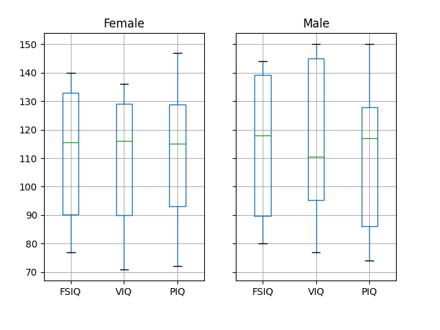
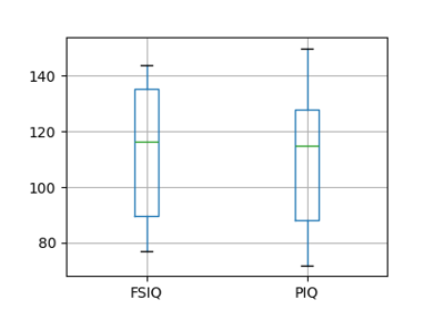
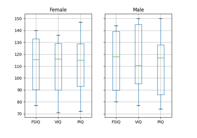
注釈
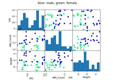
上記のプロットには groupby_gender.boxplot が使用されています ( この例 を参照)。
データのプロット
Pandasには、データフレーム内のデータの統計情報を表示するためのプロットツール (pandas.plotting, 裏でmatplotlibを使います) が用意されています:
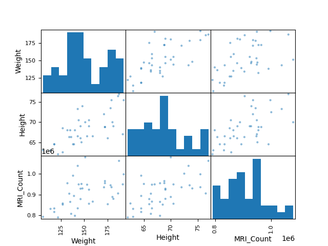
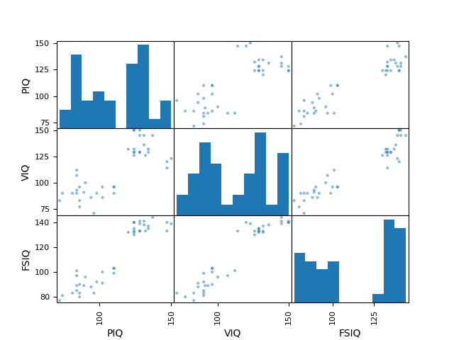
散布図行列:
>>> from pandas import plotting
>>> plotting.scatter_matrix(data[['Weight', 'Height', 'MRI_Count']])
array([[<Axes: xlabel='Weight', ylabel='Weight'>,
        <Axes: xlabel='Height', ylabel='Weight'>,
        <Axes: xlabel='MRI_Count', ylabel='Weight'>],
       [<Axes: xlabel='Weight', ylabel='Height'>,
        <Axes: xlabel='Height', ylabel='Height'>,
        <Axes: xlabel='MRI_Count', ylabel='Height'>],
       [<Axes: xlabel='Weight', ylabel='MRI_Count'>,
        <Axes: xlabel='Height', ylabel='MRI_Count'>,
        <Axes: xlabel='MRI_Count', ylabel='MRI_Count'>]], dtype=object)
>>> plotting.scatter_matrix(data[['PIQ', 'VIQ', 'FSIQ']])
array([[<Axes: xlabel='PIQ', ylabel='PIQ'>,
        <Axes: xlabel='VIQ', ylabel='PIQ'>,
        <Axes: xlabel='FSIQ', ylabel='PIQ'>],
       [<Axes: xlabel='PIQ', ylabel='VIQ'>,
        <Axes: xlabel='VIQ', ylabel='VIQ'>,
        <Axes: xlabel='FSIQ', ylabel='VIQ'>],
       [<Axes: xlabel='PIQ', ylabel='FSIQ'>,
        <Axes: xlabel='VIQ', ylabel='FSIQ'>,
        <Axes: xlabel='FSIQ', ylabel='FSIQ'>]], dtype=object)
3.1.2. 仮説検証: 2つのグループの比較
単純な統計検定 には、SciPy の scipy.stats サブモジュールを使用します:
>>> import scipy as sp
参考
SciPyは膨大なライブラリです。ライブラリ全体への簡単な要約は、 scipy 章を参照してください。
3.1.2.1. Studentのt検定: 最も単純な統計検定
標本検定: 母平均の検定
scipy.stats.ttest_1samp() は、データの基礎となる母集団の平均が与えられた値に等しいという帰無仮説を検定します。 これは T statistic と p-value を返します (関数のヘルプを参照)
>>> sp.stats.ttest_1samp(data['VIQ'], 0)
TtestResult(statistic=np.float64(30.088099970...), pvalue=np.float64(1.32891964...e-28), df=np.int64(39))
 というp値は、帰無仮説のもとではこのような極端な統計量が観測される可能性は低いことを示しています。 これは帰無仮説が偽であり、母集団の平均IQ(VIQ測定値)が0ではないことの証拠とみなすことができます。
技術的には、t検定のp値は、母集団から抽出された標本の平均が正規分布しているという仮定の下で導かれます。この条件は、母集団自体が正規分布している場合に正確に満たされます; しかし、中心極限定理により、この条件は、様々な非正規分布に従う母集団から引かれた適度に大きなサンプルに対してほぼ当てはまります。
それにもかかわらず、正規性の仮定に違反することが検定の結論に影響することを懸念する場合、 Wilcoxon signed-rank test を使えば、検定力を犠牲にしてこの仮定を緩和することができます:
>>> sp.stats.wilcoxon(data['VIQ'])
WilcoxonResult(statistic=np.float64(0.0), pvalue=np.float64(3.4881726...e-08))
二標本のt検定: 集団間の差の検定
以上、男女の平均VIQが異なることを見てきました。この差が有意かどうかを検証するため (そして、母集団の平均値に差があることを示唆するため)、 scipy.stats.ttest_ind() を用いて2標本のt検定を行います:
>>> female_viq = data[data['Gender'] == 'Female']['VIQ']
>>> male_viq = data[data['Gender'] == 'Male']['VIQ']
>>> sp.stats.ttest_ind(female_viq, male_viq)
TtestResult(statistic=np.float64(-0.77261617232...), pvalue=np.float64(0.4445287677858...), df=np.float64(38.0))
対応するノンパラメトリック検定は Mann–Whitney U test 、 scipy.stats.mannwhitneyu() です。
>>> sp.stats.mannwhitneyu(female_viq, male_viq)
MannwhitneyuResult(statistic=np.float64(164.5), pvalue=np.float64(0.34228868687...))
3.1.2.2. ペアテスト: 同一個体に対する反復測定
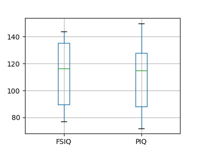
PIQ、VIQ、FSIQはIQの3つの尺度を与えます。 FISQとPIQが有意に異なるかどうかを検証してみましょう。 "独立サンプル" テストを使用することができます:
>>> sp.stats.ttest_ind(data['FSIQ'], data['PIQ'])
TtestResult(statistic=np.float64(0.46563759638...), pvalue=np.float64(0.64277250...), df=np.float64(78.0))
このアプローチの問題点は、観測データ間の重要な関係を無視していることです: FSIQとPIQは同じ人を対象に測定されます。 したがって、被験者間のばらつきによる分散は交絡となり、検定の検出力を低下させます。 このばらつきは、 "対応のある検定" または `"反復測定検定"<https://en.wikipedia.org/wiki/Repeated_measures_design>`_ を用いて取り除くことができます:
>>> sp.stats.ttest_rel(data['FSIQ'], data['PIQ'])
TtestResult(statistic=np.float64(1.784201940...), pvalue=np.float64(0.082172638183...), df=np.int64(39))
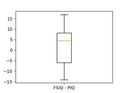
これは、一対のオブザベーション間の差に関する1標本検定に相当します:
>>> sp.stats.ttest_1samp(data['FSIQ'] - data['PIQ'], 0)
TtestResult(statistic=np.float64(1.784201940...), pvalue=np.float64(0.082172638...), df=np.int64(39))
したがって、 wilcoxon でノンパラメトリック版の検定を行うことができます。
>>> sp.stats.wilcoxon(data['FSIQ'], data['PIQ'], method="approx")
WilcoxonResult(statistic=np.float64(274.5), pvalue=np.float64(0.106594927135...))
3.1.3. 線形モデル、多因子、分散分析
3.1.3.1. Pythonで統計モデルを指定する "式"
単純な線形回帰
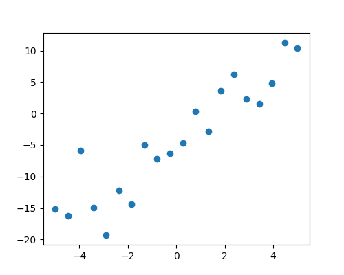
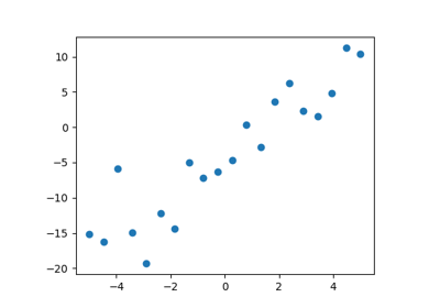
2組の観測値、 x と y が与えられたとき、我々は y が x の線形関数であるという仮説を検定したいです。 言い換えると:

ここで e は観測ノイズです。 statsmodels モジュールを使って次のことを行います:
線形モデルを当てはめます。 最も単純な戦略である ordinary least squares (OLS) を使います。
coef がゼロでないことをテストします。
まず、モデルに従ってシミュレーションデータを作成します:
>>> import numpy as np
>>> x = np.linspace(-5, 5, 20)
>>> rng = np.random.default_rng(27446968)
>>> # normal distributed noise
>>> y = -5 + 3*x + 4 * rng.normal(size=x.shape)
>>> # Create a data frame containing all the relevant variables
>>> data = pandas.DataFrame({'x': x, 'y': y})
次に、OLSモデルを指定し、それを当てはめます:
>>> from statsmodels.formula.api import ols
>>> model = ols("y ~ x", data).fit()
fitから得られる様々な統計量を調べることができます:
>>> print(model.summary())
                            OLS Regression Results
==============================================================================
Dep. Variable:                      y   R-squared:                       0.901
Model:                            OLS   Adj. R-squared:                  0.896
Method:                 Least Squares   F-statistic:                     164.5
Date:                             ...   Prob (F-statistic):           1.72e-10
Time:                             ...   Log-Likelihood:                -51.758
No. Observations:                  20   AIC:                             107.5
Df Residuals:                      18   BIC:                             109.5
Df Model:                           1
Covariance Type:            nonrobust
==============================================================================
                 coef    std err          t      P>|t|      [0.025      0.975]
------------------------------------------------------------------------------
Intercept     -4.2948      0.759     -5.661      0.000      -5.889      -2.701
x              3.2060      0.250     12.825      0.000       2.681       3.731
==============================================================================
Omnibus:                        1.218   Durbin-Watson:                   1.796
Prob(Omnibus):                  0.544   Jarque-Bera (JB):                0.999
Skew:                           0.503   Prob(JB):                        0.607
Kurtosis:                       2.568   Cond. No.                         3.03
==============================================================================

Notes:
[1] Standard Errors assume that the covariance matrix of the errors is correctly specified.
カテゴリー変数: グループまたは複数のカテゴリーを比較する
脳の大きさに関するデータに戻りましょう:
>>> data = pandas.read_csv('examples/brain_size.csv', sep=';', na_values=".")
男性と女性のIQの比較は、線形モデルを使って書くことができます:
>>> model = ols("VIQ ~ Gender + 1", data).fit()
>>> print(model.summary())
                            OLS Regression Results
==============================================================================
Dep. Variable:                    VIQ   R-squared:                       0.015
Model:                            OLS   Adj. R-squared:                 -0.010
Method:                 Least Squares   F-statistic:                    0.5969
Date:                             ...   Prob (F-statistic):              0.445
Time:                             ...   Log-Likelihood:                -182.42
No. Observations:                  40   AIC:                             368.8
Df Residuals:                      38   BIC:                             372.2
Df Model:                           1
Covariance Type:            nonrobust
==================================================================================
                     coef    std err          t      P>|t|      [0.025      0.975]
----------------------------------------------------------------------------------
Intercept        109.4500      5.308     20.619      0.000      98.704     120.196
Gender[T.Male]     5.8000      7.507      0.773      0.445      -9.397      20.997
==============================================================================
Omnibus:                       26.188   Durbin-Watson:                   1.709
Prob(Omnibus):                  0.000   Jarque-Bera (JB):                3.703
Skew:                           0.010   Prob(JB):                        0.157
Kurtosis:                       1.510   Cond. No.                         2.62
==============================================================================

Notes:
[1] Standard Errors assume that the covariance matrix of the errors is correctly specified.
3.1.3.2. 重回帰: 複数の要因を含む
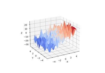
変数 z (従属変数) を2つの変数 x と y で説明する線形モデルを考えます:

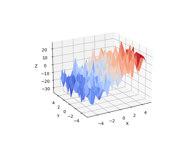
このようなモデルは、 (x, y, z) 点の雲に平面を当てはめるように3Dで見ることができます。
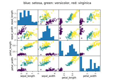
例: アヤメの花データ (examples/iris.csv)
Tip
がく片と花弁の大きさは関連する傾向があります: 大きな花はより大きいです! しかし、それに加えて種による系統的な影響もあるのでしょうか?
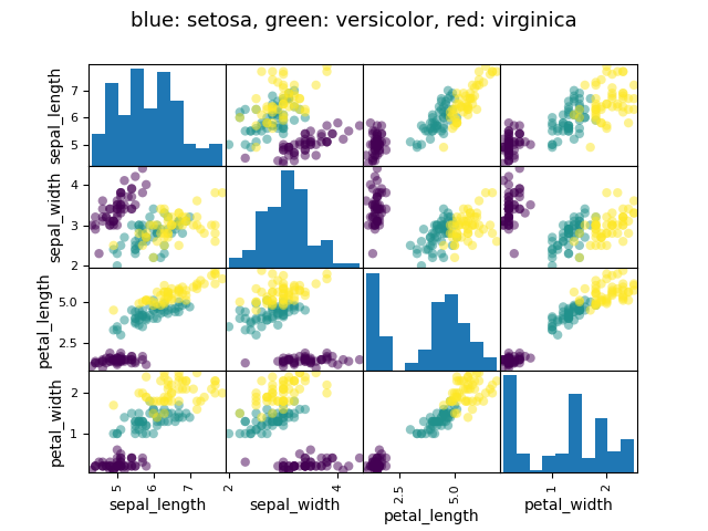
>>> data = pandas.read_csv('examples/iris.csv')
>>> model = ols('sepal_width ~ name + petal_length', data).fit()
>>> print(model.summary())
                            OLS Regression Results
==========================...
Dep. Variable:            sepal_width   R-squared:                       0.478
Model:                            OLS   Adj. R-squared:                  0.468
Method:                 Least Squares   F-statistic:                     44.63
Date:                             ...   Prob (F-statistic):           1.58e-20
Time:                             ...   Log-Likelihood:                -38.185
No. Observations:                 150   AIC:                             84.37
Df Residuals:                     146   BIC:                             96.41
Df Model:                           3
Covariance Type:            nonrobust
==========================...
                         coef    std err          t     P>|t|  [0.025      0.975]
------------------------------------------...
Intercept              2.9813      0.099     29.989     0.000      2.785     3.178
name[T.versicolor]    -1.4821      0.181     -8.190     0.000     -1.840    -1.124
name[T.virginica]     -1.6635      0.256     -6.502     0.000     -2.169    -1.158
petal_length           0.2983      0.061      4.920     0.000      0.178     0.418
==========================...
Omnibus:                        2.868   Durbin-Watson:                   1.753
Prob(Omnibus):                  0.238   Jarque-Bera (JB):                2.885
Skew:                          -0.082   Prob(JB):                        0.236
Kurtosis:                       3.659   Cond. No.                         54.0
==========================...

Notes:
[1] Standard Errors assume that the covariance matrix of the errors is correctly specified.
3.1.3.3. 事後仮説検定: 分散分析 (ANOVA)
上記のアヤメの例では、萼片の幅の影響を取り除いた上で、花弁の長さがversicolorとvirginicaで異なるかどうかを検証したいです。これは、上記で推定された線形モデルにおいて、versicolorとvirginicaに関連する係数の差を検定することとして定式化することができます。 (これは分散分析です、 ANOVA)。 このために、推定されたパラメーターに ** 'コントラスト' のベクトル** を書きます: "name[T.versicolor] - name[T.virginica]" を F-test でテストしたいです:
>>> print(model.f_test([0, 1, -1, 0]))
<F test: F=3.24533535..., p=0.07369..., df_denom=146, df_num=1>
この違いは重要なのでしょうか?
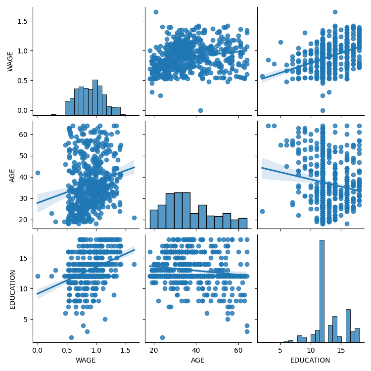
3.1.4. さらなる視覚化: 統計探索のためのseaborn
Seaborn は、単純な統計的あてはめとpandasデータフレームへのプロットを組み合わせたものです。
500人分の賃金やその他多くの個人情報が記載されたデータを考えてみましょう (Berndt, ER. The Practice of Econometrics. 1991. NY: Addison-Wesley)。
Tip
賃金データのロードとプロットの完全なコードは、 対応する例にあります 。
>>> print(data)
     EDUCATION  SOUTH  SEX  EXPERIENCE  UNION      WAGE  AGE  RACE  \
0            8      0    1          21      0  0.707570   35     2
1            9      0    1          42      0  0.694605   57     3
2           12      0    0           1      0  0.824126   19     3
3           12      0    0           4      0  0.602060   22     3
...
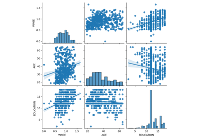
3.1.4.1. Pairplot: 散布行列
連続変数間の相互作用散布行列を表示するために seaborn.pairplot() を使用することにより、私たちは簡単に直感を持つことができます:
>>> import seaborn
>>> seaborn.pairplot(data, vars=['WAGE', 'AGE', 'EDUCATION'],
...                  kind='reg')
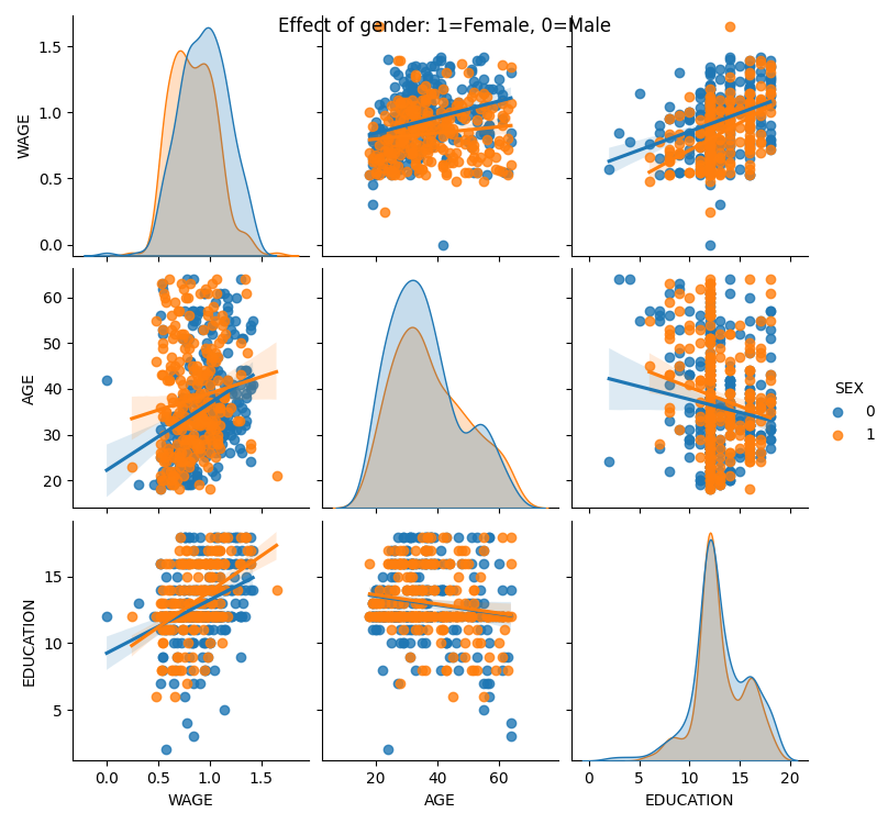
カテゴリー変数は、色相としてプロットすることができます:
>>> seaborn.pairplot(data, vars=['WAGE', 'AGE', 'EDUCATION'],
...                  kind='reg', hue='SEX')
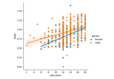
3.1.4.2. lmplot: 単変量回帰のプロット
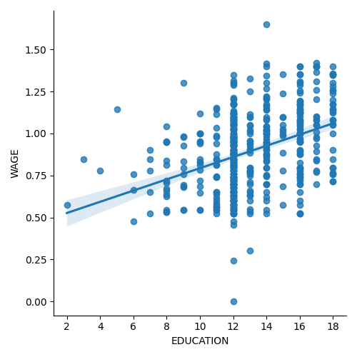
ある変数と別の変数、例えば賃金と学歴の関係を表す回帰は、 seaborn.lmplot() を使ってプロットすることができます:
>>> seaborn.lmplot(y='WAGE', x='EDUCATION', data=data)
3.1.5. 相互作用のテスト
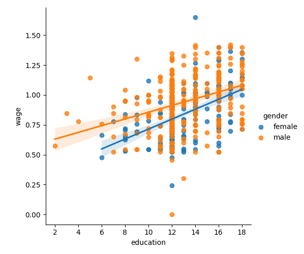
賃金は女性より男性の方が学歴とともに上昇するのでしょうか?
Tip
The plot above is made of two different fits. We need to formulate a single model that tests for a variance of slope across the two populations. This is done via an "interaction".
>>> result = sm.ols(formula='wage ~ education + gender + education * gender',
...                 data=data).fit()
>>> print(result.summary())
...
                            coef    std err    t     P>|t|  [0.025      0.975]
------------------------------------------------------------------------------
Intercept                   0.2998   0.072    4.173   0.000     0.159   0.441
gender[T.male]              0.2750   0.093    2.972   0.003     0.093   0.457
education                   0.0415   0.005    7.647   0.000     0.031   0.052
education:gender[T.male]   -0.0134   0.007   -1.919   0.056    -0.027   0.000
==========================...
...
教育は女性よりも男性により多くの利益をもたらすと結論づけられるでしょうか?
3.1.6. 画像の全コード
統計の章のコード例。